Case Study 01

International
Energy Initiative.

Transforming a static USAID-backed health electrification website into a dynamic partnership platform, connecting investors, donors, and healthcare workers across sub-Saharan Africa.
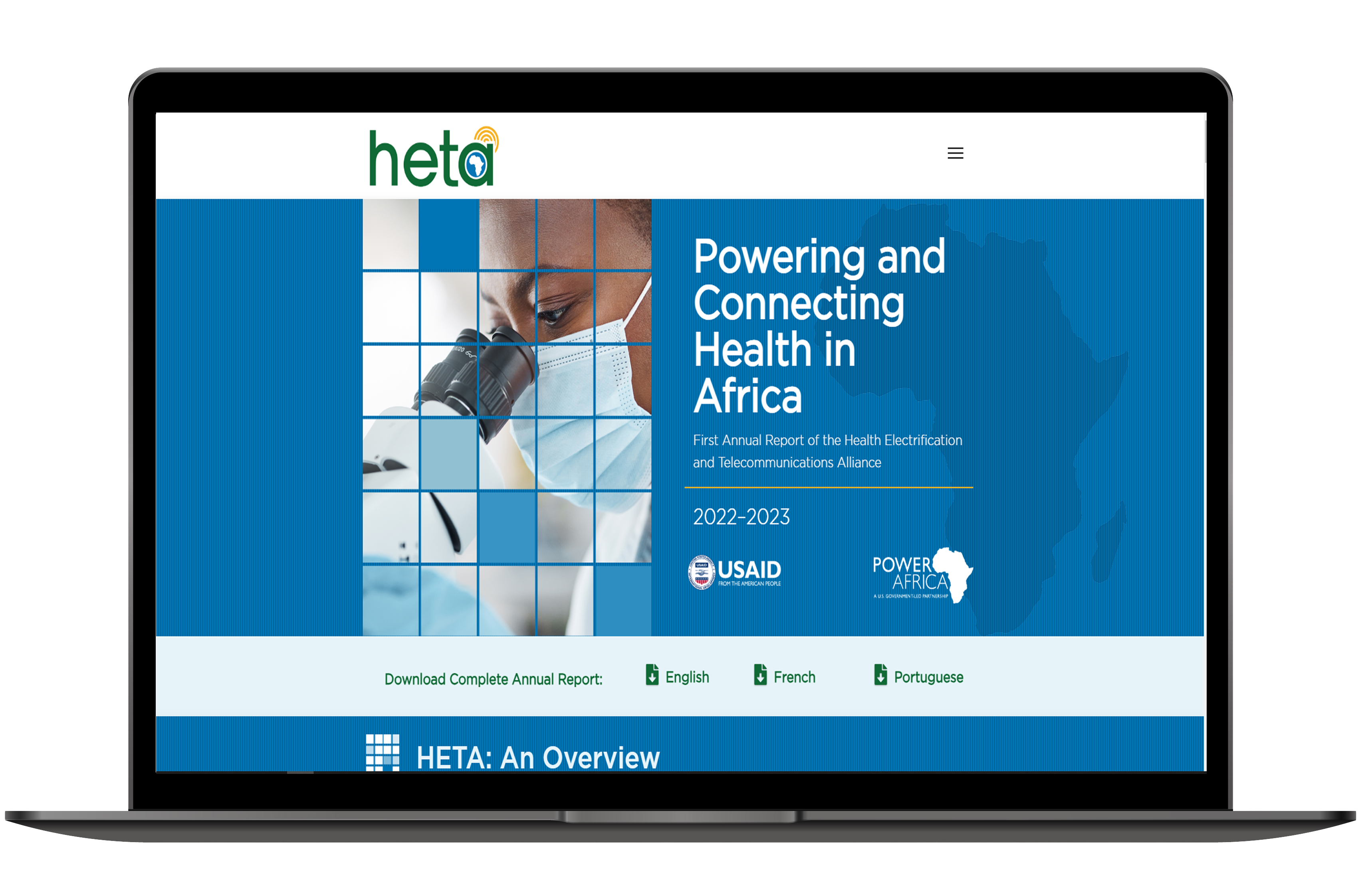
HETA platform mockup
Client
HETA / USAID
Role
Lead Product Designer
Platform
Web
Timeline
5 Months
Tools
Figma · FigJam · Optimal Workshop

The challenge.

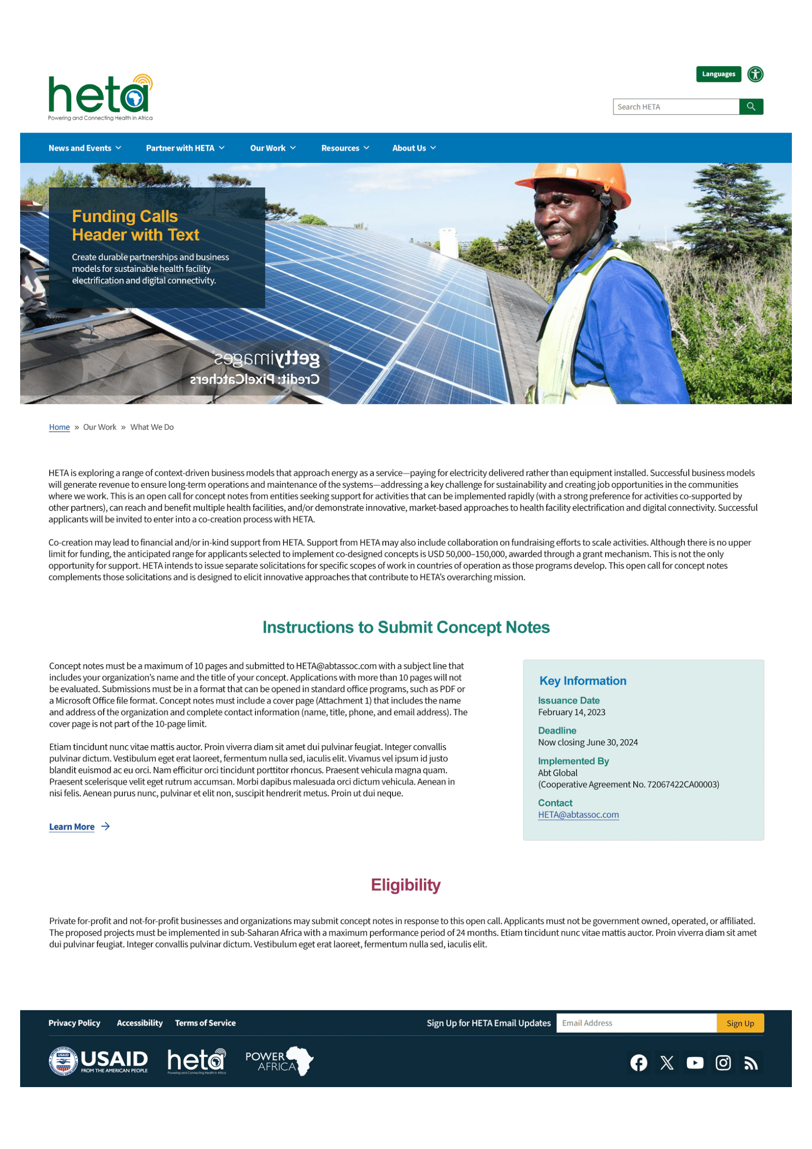
The Health Electronic and Telecommunications Alliance (HETA), a USAID-backed initiative, aimed to electrify and digitally connect 10,000 health facilities across sub-Saharan Africa using renewable energy partnerships.

However, HETA's existing website functioned only as a static information page, failing to communicate impact or attract the partners needed to reach scale. Over 100,000 health facilities in the region operate without reliable electricity, critically restricting diagnostic testing, oxygen systems, and vaccine refrigeration.

The gap between HETA's ambition and their digital presence was costing them credibility, partner engagement, and ultimately, lives.

"The existing site read like a report, not a call to action. Partners couldn't find proof of progress, and donors had no reason to commit."- Matt D

Project Impact

42%
Navigation time reduced
via Optimal Workshop testing
89%
Task success rate
up from 55% baseline
2.3×
Stakeholder satisfaction
post-redesign increase

Understanding who we were designing for.

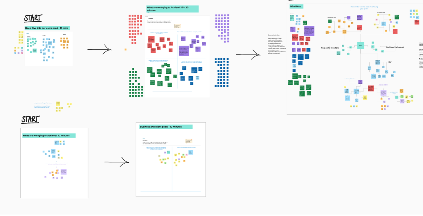
I facilitated a structured design workshop to align cross-functional stakeholders around user needs, business goals, and success criteria. Moving from divergent exploration into focused synthesis, we built a shared mental model across key stakeholder groups, resulting in clear problem framing and a strategic foundation for subsequent design decisions.

100K+
health facilities across the region operate without reliable electricity, the scale of need HETA had to make legible to partners and donors in seconds.
6
African territories the architecture had to flex across, demanding a modular, regionally adaptable content model rather than a single static page.
0
clear pathways for a healthcare partner to move from interest to application, the old site surfaced no proof of progress and no obvious next step.
🔍
Credibility gap

Users struggled to find credible proof of HETA's on-the-ground progress, eroding trust before a partnership conversation even began.

📄
Report-like tone

Partners felt the old content read like a technical report rather than an inspiring call to action: passive voice, no urgency, no story.

📐
Scalability need

Stakeholders prioritized modularity and regional flexibility, requiring a site architecture that could grow across six African territories.

Card sorting results
Collaboration Workshop – Mural

Two distinct audiences, one platform.

Emily A — Healthcare Administrator
Emily A.
Healthcare Administrator · Tanzania
A seasoned facility administrator with 10+ years optimizing healthcare operations. Needed transparent eligibility information and a streamlined funding application process. Frustrated by vague requirements and buried application pathways, slow-loading pages, and outdated content.
Funding Applicant
Ben B — Impact Investor
Ben B.
Impact Investor · United States
A seasoned investor with 15+ years in healthcare innovations and tech startups. Required data-backed proof of HETA's progress and a sense of urgency to trigger financial commitment. Needed real human stories and visualized impact before being asked to give.
Impact Investor

Three pillars. One cohesive journey.

I structured the new Information Architecture around three experience pillars that guided both navigation and content placement, ensuring donors could explore outcomes before being asked to commit.

Because many facilities operate in low-bandwidth regions, every pillar had to earn its weight. The architecture prioritized fast-loading, mobile-first content so the impact story stayed legible even on constrained connections.

01
Discover

Surface HETA's mission, reach, and real-world impact through data visualizations and regional facility maps. Build trust before asking for anything.

02
Partner

Streamline the funding application pathway and concept note submission for healthcare organizations. Reduce friction, increase clarity.

03
Impact

Give investors the data-driven proof of outcomes they need to commit. Dynamic dashboards of facilities reached, updated in real time.

From card sorting to high-fidelity.

Stakeholder workshops

Facilitated cross-functional alignment sessions with regional partners and USAID leads, converging on shared success criteria and user priorities.

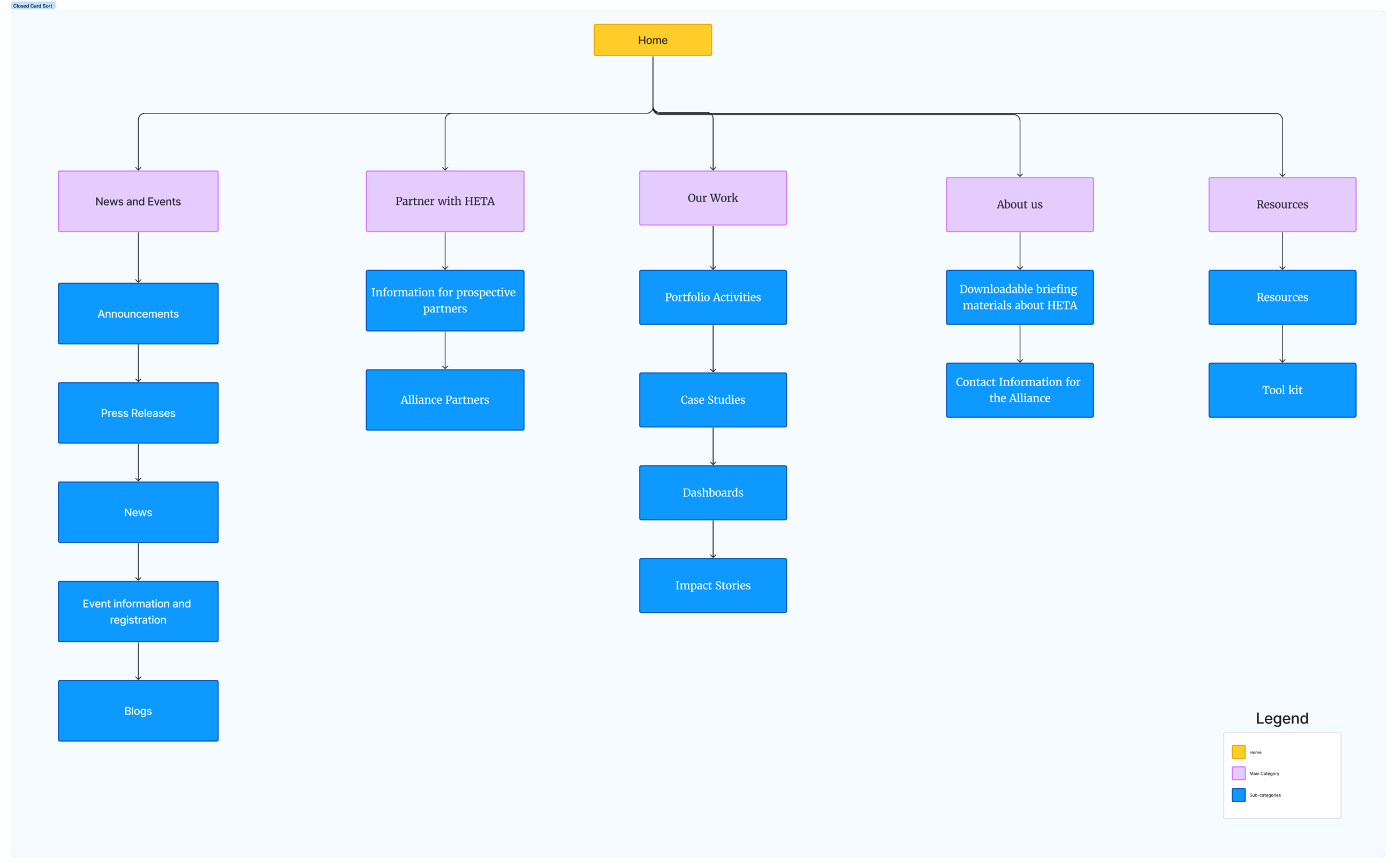
Open and Closed card sorting

Used Optimal Workshop to understand how users mentally group content, revealing unexpected information clusters that challenged our assumptions.

Tree testing

Validated the proposed IA before any visual work began. This saved dozens of hours in the high-fidelity phase and gave stakeholders data to trust.


Mid-fidelity wireframes

Translated validated architecture into testable layouts, iterating on navigation flows and content hierarchy based on usability feedback.

Card sorting results
Data-driven Sitemap – Figma
Mid-fidelity wireframes
Mid-fidelity Wireframes – Figma

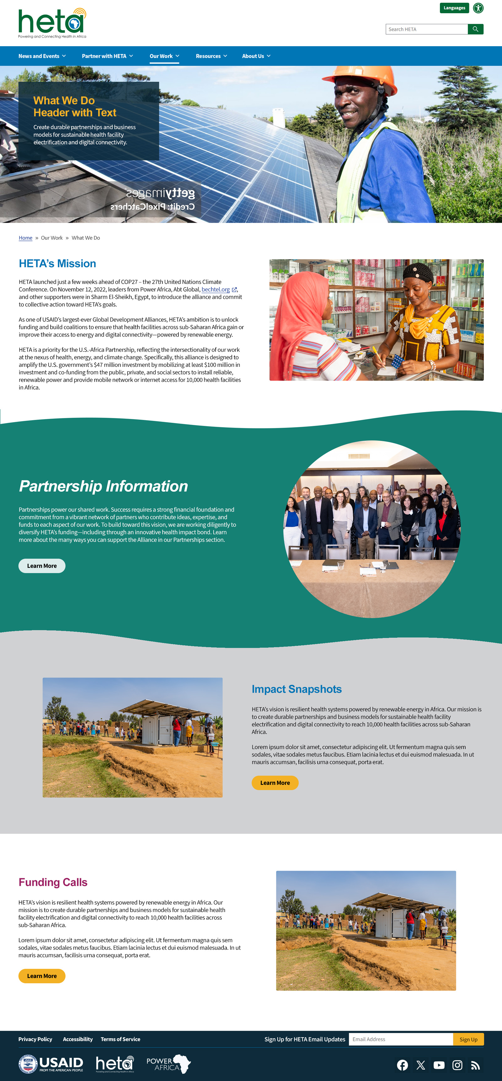
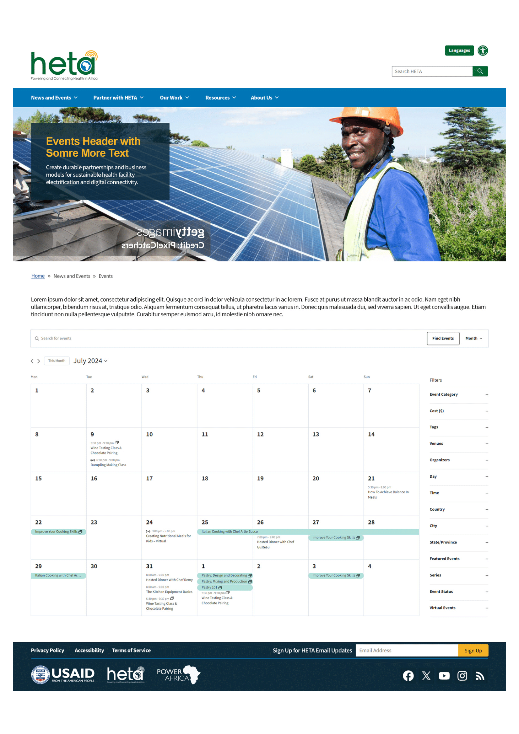
A dynamic partnership hub.

The final experience transformed HETA from a static page into a dynamic partnership hub. Integrated data visualizations of facilities reached, clearer calls to action, and a flexible modular layout designed to support regional expansion across six African territories.

Before
  • Static information page with no proof of impact
  • Report-like tone with passive voice and no clear call to action
  • No pathway for partners to move from interest to application
  • Rigid layout that could not flex across regions
  • 55% task success rate in early testing
After
  • Dynamic hub with live data visualizations of facilities reached
  • Mission-led narrative built around a clear call to action
  • Streamlined partner onboarding and concept note submission flow
  • Modular architecture built to scale across six African territories
  • 89% task success rate, up from a 55% baseline
Integrated impact data visualizations Streamlined partner onboarding flow Modular regional expansion architecture Mobile-first low-bandwidth optimization Accessible WCAG 2.1 AA compliant

What I learned.

Challenge

Balancing the dense technical requirements of a USAID-backed initiative with the need for an inspiring, high-impact visual story without oversimplifying the complexity on the ground.

Key Lesson

Validating the IA early through tree testing saved dozens of hours in the high-fidelity phase. Data, not aesthetics, is the best way to earn stakeholder buy-in.

Future Approach

I'd involve regional healthcare workers even earlier in the wireframing stage to ensure the Partner portal accounts for varying bandwidth conditions and mobile-first constraints.

Next case study

High-Complexity
Industrial Reporting.

View project All projects